
Article
Reading Career Readiness Data Across a Whole Cohort
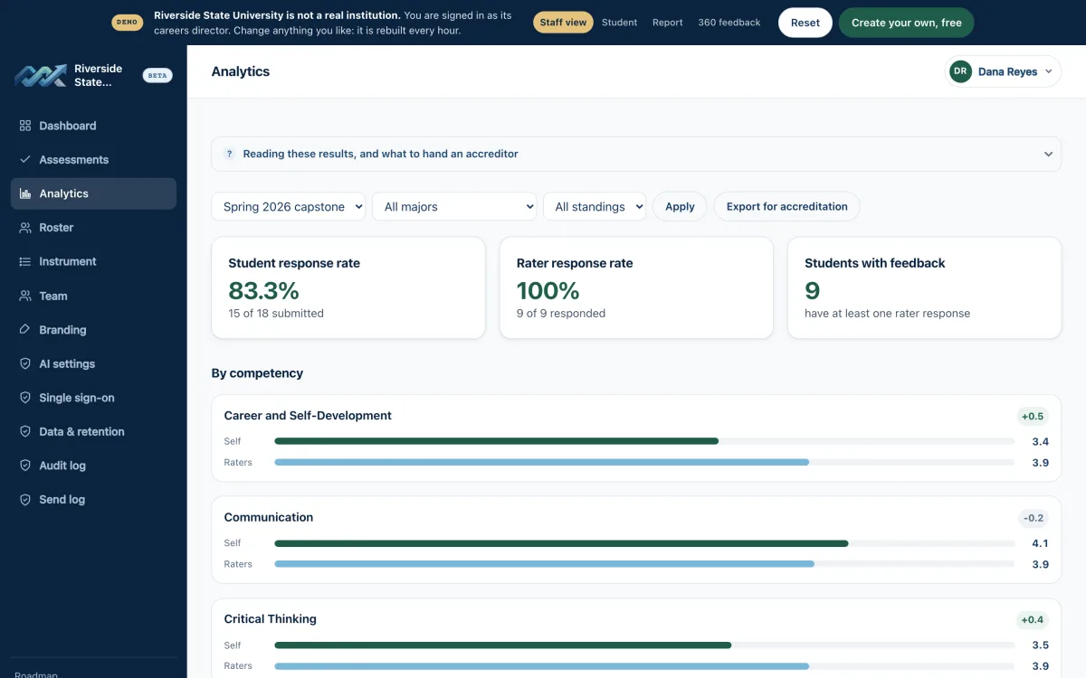
Three cuts of cohort-level career readiness data reliably change decisions: the gap between student self-ratings and supervisor ratings on the same competency, results broken out by experience type (internship, co-op, clinical, on-campus employment), and the shape of the bottom quartile rather than the movement of the mean. Almost everything else you can slice, including the department-by-department comparison your provost will ask for first, is either too noisy to act on or too confounded by unequal response rates to defend. The individual student report answers "how did this student do." The cohort view has to answer a different question: where would an intervention actually land.
The cuts worth building a dashboard around
Self versus supervisor, competency by competency
This is the most decision-useful cut you have, for a structural reason: it is paired within student. When a student and their supervisor both rate communication, the difference between those two scores is not affected by which students happened to respond, because both scores come from the same placement. Response rate differences across programs still shape which pairs you see, but the comparison itself is internally controlled in a way that program means never are.
What you are looking for is a consistent directional gap on one or two competencies. If 140 students rate their own professionalism at a mean of 4.3 and their supervisors rate the same students at 3.6, that is not a measurement error to be reconciled. It is a curricular finding: students do not know what workplace professionalism is being judged against. That is addressable through pre-placement orientation and mid-term check-ins. Compare that to a competency where self and supervisor ratings sit within 0.1 of each other, which tells you students have calibrated expectations even if the absolute level is modest.
Experience type
Experience type is usually a larger source of variance than academic program, and it is more actionable. A semester-long paid co-op with a defined supervisor produces different competency development than a 60-hour unpaid observation placement, and pooling them hides both. Break your cohort by structure first: paid versus unpaid, hours banded, whether a named supervisor was assigned, whether the placement included a formal midpoint review.
The honest limitation here is selection. Students who land competitive paid co-ops are not a random sample of your cohort. If co-op students score higher on initiative, you cannot attribute that to the co-op. What you can do is notice when a structural feature correlates with a competency gap in a direction that selection does not explain, for example when unpaid placements show supervisor ratings on career and self-development that are a full point below every other category. That points at supervision quality, not student quality.
The bottom quartile
Means move slowly and hide the students you are supposed to be serving. Look at the count of students whose supervisor rated them below 3 on any competency, and then look at whether those students cluster: same site, same supervisor, same term, same placement type. A cohort mean of 3.9 can contain twelve students who were flagged as not meeting basic teamwork expectations, all of them at two employers. That is a site management decision that no average will surface.
The cuts that mostly generate noise
Small-n program comparisons. On a five-point scale, typical within-cohort standard deviation runs around 0.7. With nine respondents, the standard error of a mean is about 0.23, which puts a 95 percent confidence interval near plus or minus 0.46. A program showing 3.8 against an institutional 4.1 has told you nothing. Do not publish it, and do not let it appear on a dashboard where someone else will publish it for you.
Term-over-term changes under 0.2 on any single competency. Rater composition changes between terms, employer mix changes, and the instrument itself has noise. Treat single-term movement as a prompt to look at the underlying distribution, not as a trend.
Demographic breakouts below roughly 15 respondents. Beyond the statistical fragility, small-cell reporting on protected characteristics creates real re-identification risk in a dataset where students, supervisors, and sites are all named. Suppress the cell and aggregate across years instead.
Overall composite scores. Collapsing eight competencies into one number produces something that moves without telling you what moved. If your reporting requirement demands a composite, publish it alongside all eight component means, never alone.
Why ranking departments on averages is indefensible
Response rate is not a nuisance variable in this data. It is correlated with exactly the things you are trying to measure. A department where the internship coordinator personally emails every supervisor twice will hit a 75 percent supervisor response rate. A department where the request goes out once from a shared inbox will hit 25 percent. Those two departments are not producing comparable numbers, and the direction of the bias is not neutral: supervisors of students who struggled are less likely to complete an evaluation, and students who had a poor placement are less likely to self-assess at all. The department with the worse process will often look better.
So the rule is: no cross-department comparison unless both units clear a minimum n and a minimum response rate, and the response rates are within about 15 points of each other. In practice that leaves you comparing your three largest programs and reporting the rest descriptively. That is a real constraint, and it is better than a ranking your deans will correctly reject the first time it disadvantages them.
What holds up instead is within-department change over time, where the unit is compared to its own prior cohort with response rate stated for both periods. Competency-level comparison against a national or peer-institution benchmark also holds up better than internal ranking, because it moves the conversation from "which of us is worst" to "where are we all below reference." Platforms that aggregate across institutions, including the Career Readiness Report, make that reference available without the internal politics.
Reporting discipline that survives scrutiny
Put n and response rate immediately adjacent to every number, in the same visual element, not in a footnote. Report distributions, not just means: a stacked bar of rating frequencies per competency is more informative and harder to misread than a bar chart of averages. State the suppression threshold on the page itself so a reader knows why a cell is blank. When you present to a curriculum committee, bring the rater gap and the bottom-quartile clustering, and leave the program rankings out of the deck entirely. The first time you show a chart where a department looks bad because of its own diligent follow-up, you lose the ability to use the data for anything.
The Career Readiness Report is free for every college and university. Open now, in beta.
Create your institution